Concept
The Community Share & Care is a smart food bank station that utilizes a locker system for people to both donate & receive items.
Target Audience
Anyone who lacks food security or security of other essential items, no matter how long term the need is. This concept also appeals to those who are interested in contributing to community assistance.
Age Range: older children - adults of all ages.
Income: may target low income households, though insecurity of necessities can occur to anyone.
Design Process
1. Market research + sketching
2. Kiosk design
3. Development of brand identity
4. Flow diagram
5. Wireframes
6. Screen designs
7. Prototyping screen designs
1. Market research + sketching
Feeding America, a network of 200 food banks, 21 statewide associations, and 60,000 partner organizations, released a report revealing that over 53 million people sought help from food banks and meal programs in 2021. With food prices rising in 2024, the demand for assistance has increased, but most food pantries and meal programs are only open during limited hours.
To address this, a proposed solution is a 24/7 donation station with lockers that would allow individuals to both donate and receive food or essential items at any time, helping bridge the gap for those in need.
Sources: (Feeding America, www.feedingamerica.org. Recycle Track Systems, www.rts.com)
2. Kiosk design
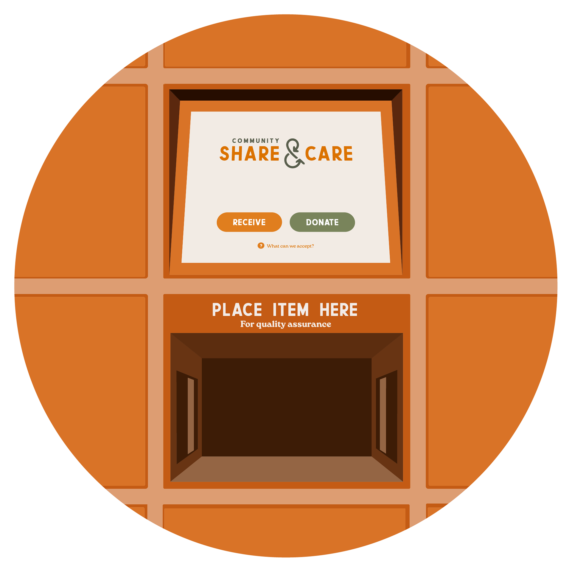
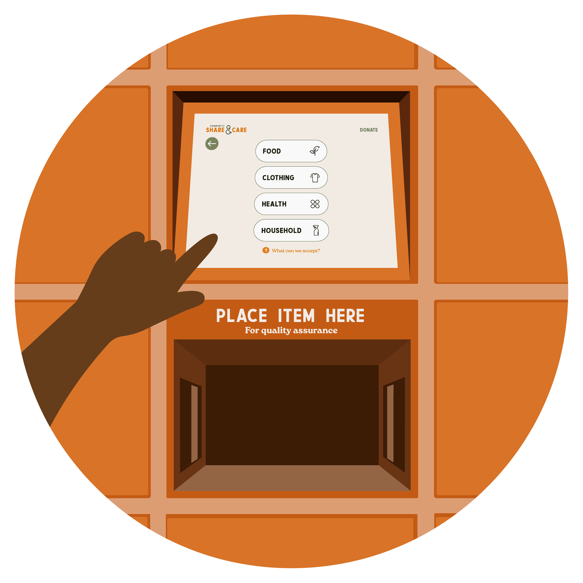
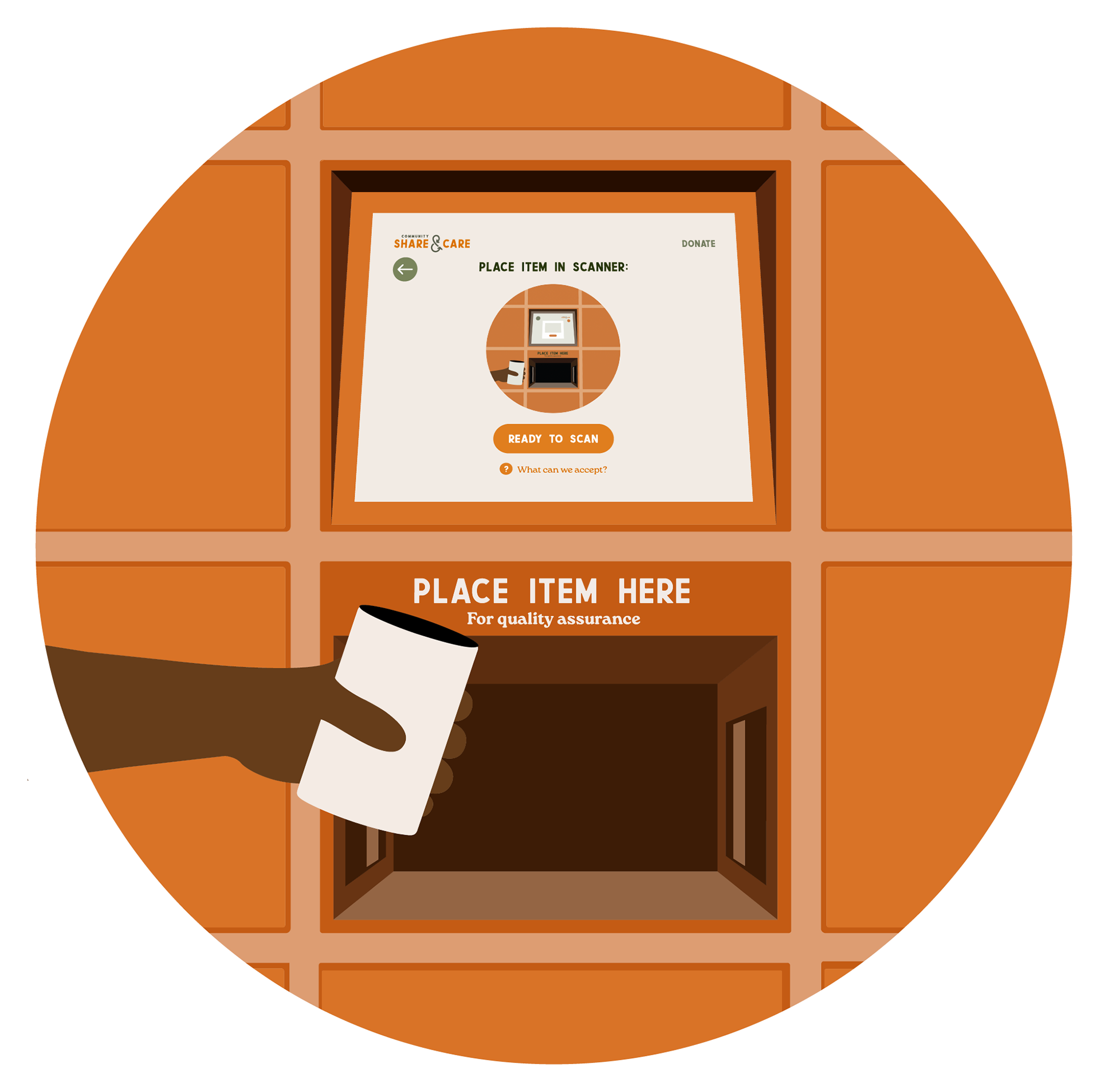
This locker system is open 24/7, unlike traditional food banks. Donations help people in need, as well as reduce waste of food, clothing and other goods. For donations, users are guided through a series of steps to categorize the item. The item is then scanned to for quality assurance. Then, if the item is accepted, is placed in an available locker.
To recieve items, users first see an overview of what is in the lockers, with icons depicting the type of item. Upon choosing a filled locker, the user gets a preview of the item including a photo and desciption. They can then choose to recieve the item or leave it in the locker.

3. Development of brand identity
For the branding of the Share & Care, the overall message I wanted the visual identity to convey was one of approachability. The color orange is used to raise awareness of child hunger and food insecurity, so it seemed fitting to utilize this in part of the visual identity of this concept.
4. Flow diagram
The first step in designing the screens for the Share & Care kiosk was a flow diagram to establish the steps a user would take to complete a donation or to receive an item.
5. Wireframes
6. Screen designs
7. Prototype
Interact with the prototyped kiosk screen design below. Not all buttons are clickable, as just a sample of the idea was produced, intended to give the overall sense a participant using the Share & Care kiosk would get.
